Gallery · The Operator
5.4/10
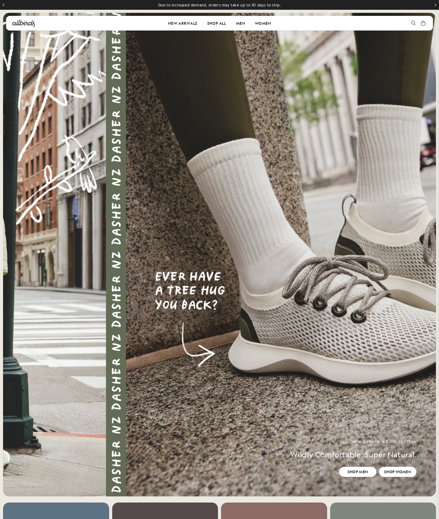
Allbirds' homepage
“Gorgeous photography, but you're leading with bad news and hiding the register.”
This page prioritizes aesthetics over revenue. Slapping a 30-day shipping delay at the very top of the funnel is a massive bounce trigger that kills high-intent traffic instantly. To make matters worse, your primary cash registers—the shop buttons—are shrunken and shoved into the bottom corner, forcing users to hunt for the exit. You are taxing high-intent attention and bleeding conversions before the first click.
Narrative & Storytelling
6.5/10
Benefit copy sells outcomes well, but competing brand messages dilute the core pitch and delay action.
Usability
4.0/10
Friction points greet users immediately at entry, while dual CTAs force a decision tax that stalls the funnel.
Visual Design
5.8/10
Stunning photography, but the visual hierarchy completely fails to prioritize the actual conversion elements.
Innovation
5.0/10
A standard e-commerce hero that misses obvious opportunities to streamline the path to purchase.
What's wrong
-
Shipping delay notice kills high-intent traffic instantly
Slapping a 30-day shipping warning at the top of the funnel (E1) without any framing or sweetening offer acts as an immediate exit cue for ready-to-buy users.
-
Sidelined and shrunken primary conversion buttons
Shoving 'SHOP MEN' and 'SHOP WOMEN' (E10, E11) into the bottom-right corner forces users to hunt for the exit. It creates massive friction at the exact moment of high intent.
-
Decision tax from identical dual-path buttons
Presenting two identical white buttons forces users to self-segment immediately without a unified entry point. This split path triggers hesitation and drops conversion rates.
What to fix first
-
Mitigate shipping friction with a sweetening offer
Rewrite the banner (E1) to frame the delay as high demand and pair it with an incentive like free shipping to keep buyers in the funnel.
-
Enlarge and center the primary conversion block
Move the headline and buttons (E8, E9, E10, E11) to the lower-center for maximum visibility. Scale up the buttons by 20% to capture immediate clicks.
-
Establish clear visual hierarchy between the CTAs
Use historical traffic data to make the higher-converting gender button solid dark green and the other secondary, eliminating the split-attention penalty.
Get this for your own screens
Upload a screenshot and get a scored, evidence-backed critique in about a minute. Your first report is free — no account needed.
Critique your design