Gallery · The Operator
7.2/10
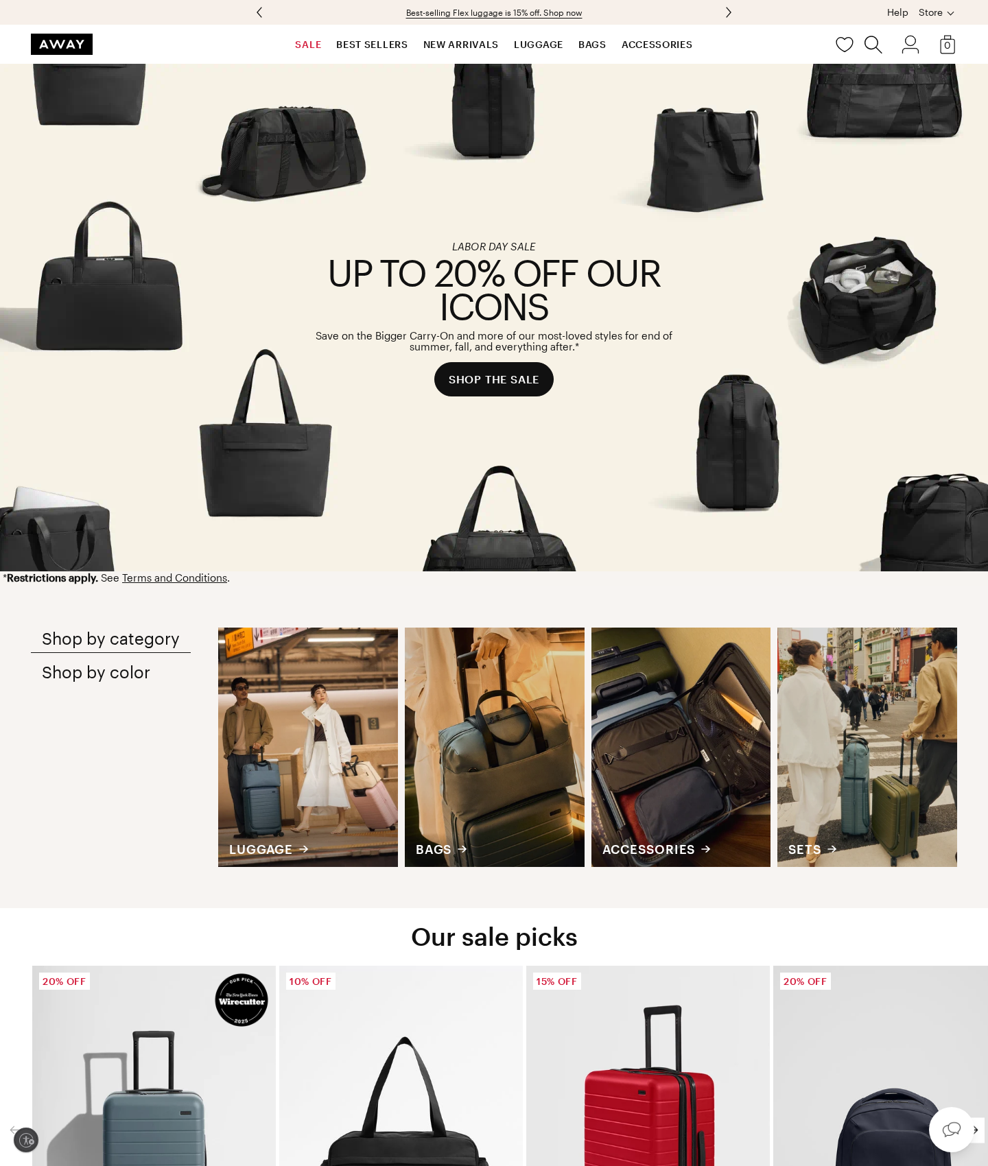
Away's homepage
“Clean funnel focus, but visual clutter leaks clicks on your CTA.”
The hero's single-CTA design prevents early funnel drop-off, but crowding the main black button with dark product silhouettes dilutes its click-through rate. Below the fold, flat category links act as friction points, triggering user hesitation where they should be driving discovery. Fortunately, placing high-authority trust badges directly on product cards recovers momentum right at the point of purchase.
Narrative & Storytelling
7.5/10
The single-minded promo focus keeps users in the funnel, though the copy leans too heavily on raw discounts rather than high-value travel outcomes.
Usability
6.8/10
Navigation paths are clear, but passive, low-contrast interactive controls below the fold cause user hesitation and stall browsing momentum.
Visual Design
7.0/10
Premium aesthetic, but high-contrast background elements crowd the main CTA, diluting its visual dominance and click-through potential.
Innovation
6.5/10
Standard e-commerce grid patterns executed cleanly, though it misses opportunities to innovate on friction-free checkout or interactive sizing.
What's wrong
-
Visual clutter swallows the primary conversion CTA
The hero's floating black product silhouettes crowd the solid black CTA button. This lack of visual isolation dilutes the button's contrast, causing user hesitation and leaking clicks at the very top of the funnel.
-
Passive category tabs stall user browsing momentum
Flat, low-contrast text links for 'Shop by category' and 'Shop by color' lack interactive affordances. Users mistake them for static text, causing drop-off before they even discover the product catalog.
-
Hero copy misses high-value emotional hooks
Focusing solely on raw discount percentages leaves money on the table. Pairing the promo with aspirational travel outcomes would better justify the premium price point and drive higher average order values.
What to fix first
-
Isolate the primary CTA to maximize click-through rate
Clear out the product silhouettes immediately flanking the 'SHOP THE SALE' button. Giving the CTA dedicated breathing room forces immediate focus and drives higher click-through rates.
-
Convert flat category links into high-contrast pill buttons
Redesign the flat text filters into high-contrast, pill-shaped toggle buttons. This instantly signals interactivity, lowering friction and encouraging deeper catalog exploration.
-
Inject high-value travel outcomes into hero copy
Rewrite the hero subheadline to pair the discount with premium product longevity and seamless travel. This shifts the focus from cheapness to high-value utility, boosting conversion intent.
Get this for your own screens
Upload a screenshot and get a scored, evidence-backed critique in about a minute. Your first report is free — no account needed.
Critique your design