Gallery · The Advocate
4.5/10
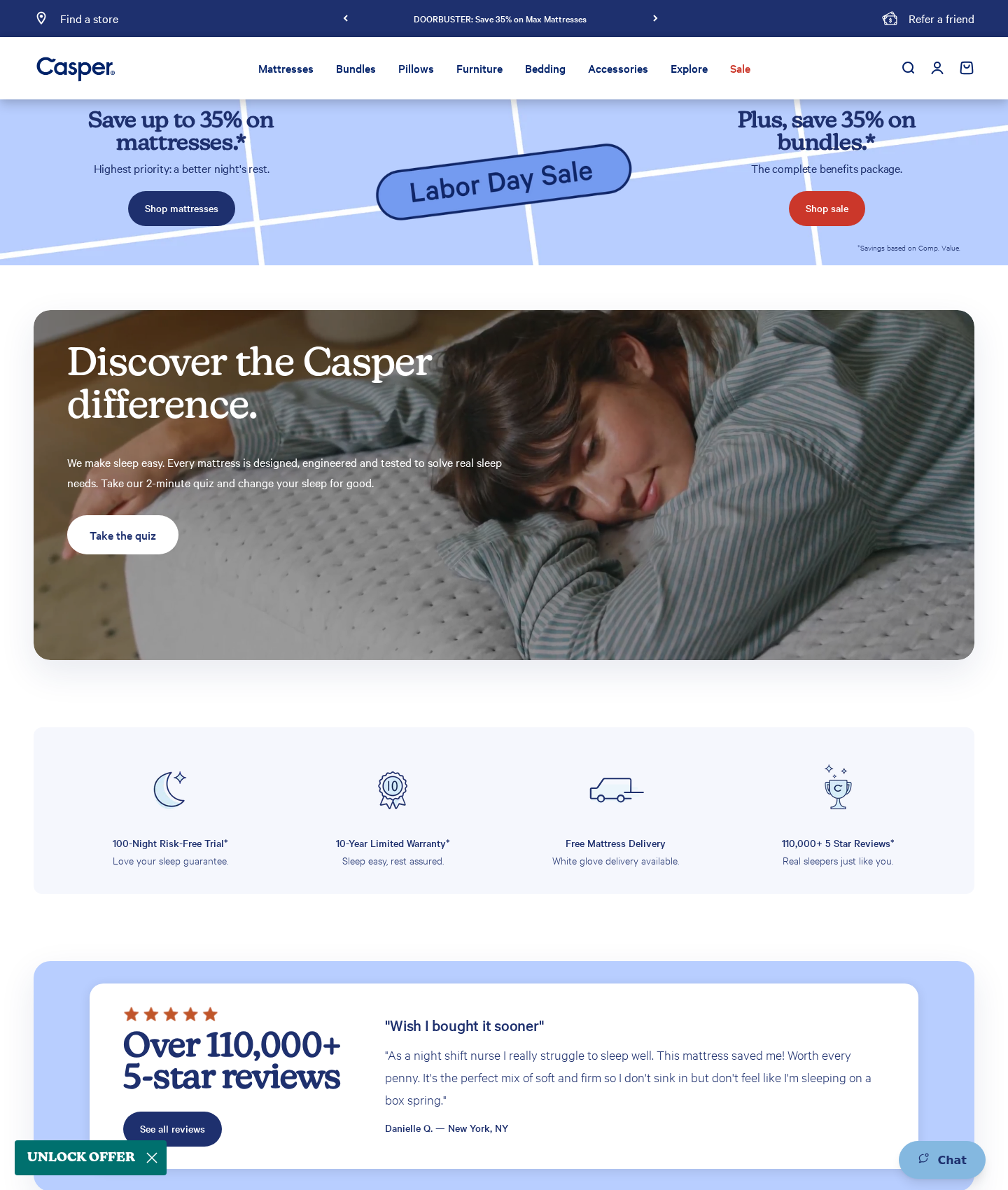
Casper's homepage
“A beautiful storefront that locks out visually impaired shoppers.”
Casper's clean aesthetic prioritizes minimalism over basic access. Text overlaid on busy photos and tiny, low-contrast footnotes block visually impaired shoppers from reading essential details. Relying solely on red text to signal sales locks out colorblind buyers entirely. A beautiful storefront is useless if a portion of your audience cannot read the labels or the price.
Narrative & Storytelling
4.8/10
The layout flows logically, but key promotional cues rely entirely on color, leaving colorblind shoppers behind.
Usability
4.2/10
Severe contrast failures and tiny touch targets create physical barriers to basic interaction.
Visual Design
4.6/10
A beautiful layout is ruined when text disappears into photographic backgrounds.
Innovation
4.0/10
The interface sticks to standard marketing templates, offering no proactive tools for inclusive browsing.
What's wrong
-
White text on photographic backgrounds
The heading 'Discover the Casper difference.' in E6 sits directly on light-colored bedsheets. Without a solid background or scrim, the text vanishes for anyone with low vision.
-
Color-only cues in primary navigation
The 'Sale' link in E2 uses red text as its only differentiator. Colorblind shoppers cannot see this distinction, locking them out of promotions.
-
Illegible pricing disclaimers
The footnote in E3 is rendered in microscopic, low-contrast text. This hides essential pricing terms from shoppers with moderate visual impairments.
What to fix first
-
Add a high-contrast container to the secondary banner
Place a solid or high-opacity dark container behind the text in E6. This ensures the words remain readable regardless of the background image.
-
Add non-color indicators to the sale link
Add an underline or a bold weight to the 'Sale' link in E2. This ensures its promotional status does not rely solely on color.
-
Enlarge and darken banner footnotes
Enlarge the '*Savings based on Comp. Value' footnote in E3 to at least 12px and change its color to dark blue to ensure legibility.
Get this for your own screens
Upload a screenshot and get a scored, evidence-backed critique in about a minute. Your first report is free — no account needed.
Critique your design