Gallery · The Operator
5.2/10
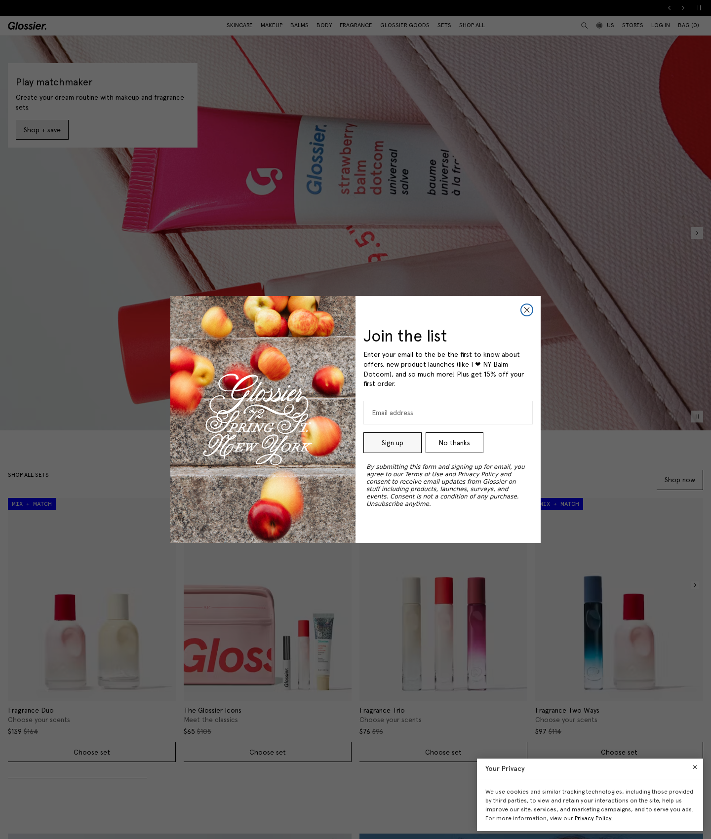
Glossier's homepage
“Double overlays and twin buttons are killing conversions before users browse.”
You are leaking conversions the second users land. Forcing a newsletter modal and cookie banner simultaneously triggers instant drop-off. Worse, the opt-out button has the same visual weight as the signup, actively helping users leave. Fix the hierarchy, lead with the financial hook, and clear the path to purchase.
Narrative & Storytelling
5.5/10
The hero banner pitches conceptual 'matchmaking' instead of bundle value, while the newsletter pop-up buries its financial hook.
Usability
4.8/10
Simultaneous administrative overlays create immediate friction, forcing users to close two popups before they can browse.
Visual Design
6.2/10
Strong editorial photography is wasted on a cramped, low-hierarchy modal layout.
Innovation
4.0/10
Relies on generic, high-friction templates that prioritize aggressive list-building over immediate shopping intent.
What's wrong
-
Double-overlay entry tax
Displaying the email modal and cookie banner simultaneously forces users to clear two administrative hurdles before browsing. This immediate friction spikes early drop-off.
-
Identical styling on opt-out and opt-in
Styling 'Sign up' and 'No thanks' identically gives the exit path equal weight. You are paying to acquire traffic only to make leaving as attractive as converting.
-
Burying the 15% discount hook
The primary incentive—15% off—is hidden in small body copy, while the headline wastes prime real estate on 'Join the list'. Lead with the money.
What to fix first
-
De-emphasize the opt-out and style primary CTA
Make 'Sign up' a solid black button with white text. Strip the border from 'No thanks' and turn it into a low-contrast text link below the main button to guide users down the conversion path.
-
Lead with the 15% discount in the headline
Swap 'Join the list' for 'Get 15% off your first order'. Put the financial incentive front and center to immediately boost signup rates.
-
Sequence the cookie banner and newsletter triggers
Delay the newsletter modal until the cookie banner is resolved or the user scrolls 50% of the page. Stop hitting high-intent traffic with a double wall of popups.
Get this for your own screens
Upload a screenshot and get a scored, evidence-backed critique in about a minute. Your first report is free — no account needed.
Critique your design