Gallery · The Perfectionist
6.8/10
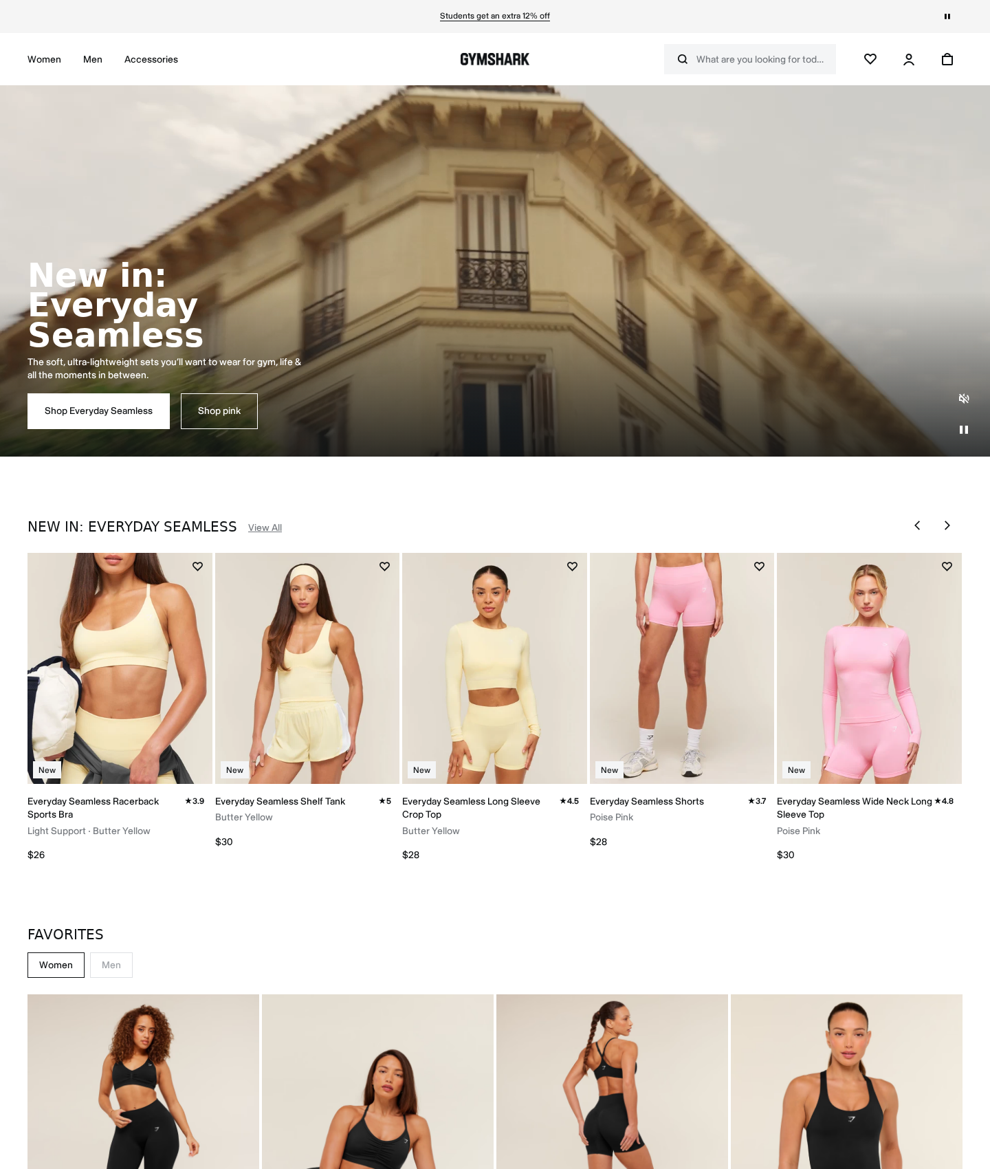
Gymshark's homepage
“A sharp athletic canvas tripped up by visual and structural contradictions.”
High-contrast styling gives this interface immediate athletic energy. But the hero section stumbles by forcing a choice between a collection launch and a single color. Below the fold, typographic discipline collapses from sentence case to shouting uppercase. Fix these details to turn a template into a brand.
Narrative & Storytelling
6.0/10
The layout highlights the new collection but dilutes the story with a mismatched backdrop and split hero actions.
Usability
7.2/10
Navigation and carousel patterns are highly intuitive, but secondary controls lack clear active states.
Visual Design
7.0/10
Excellent grid alignment and high-contrast styling, marred by erratic typographic choices.
Innovation
5.5/10
The layout relies entirely on safe, standard e-commerce blueprints.
What's wrong
-
Split hero actions dilute user focus
Side-by-side buttons force a premature aesthetic choice. Users must choose a color before seeing the collection, weakening the primary funnel.
-
Inconsistent header capitalization
Mixing sentence case and uppercase headers creates a jarring transition. A premium brand requires unified typography.
-
Low-contrast inactive tab looks disabled
The 'Men' tab lacks contrast, appearing locked. Users will assume menswear is unavailable.
What to fix first
-
Consolidate the hero to one primary action
Remove the 'Shop pink' button. Streamline the decision path and focus attention on the main collection.
-
Standardize section header capitalization
Change the carousel header to sentence case. This matches the hero and unifies the typographic voice.
-
Increase inactive tab contrast
Darken the border and text of the unselected 'Men' tab. Make it clearly interactive without competing with the active state.
Get this for your own screens
Upload a screenshot and get a scored, evidence-backed critique in about a minute. Your first report is free — no account needed.
Critique your design