Gallery · The Perfectionist
6.2/10
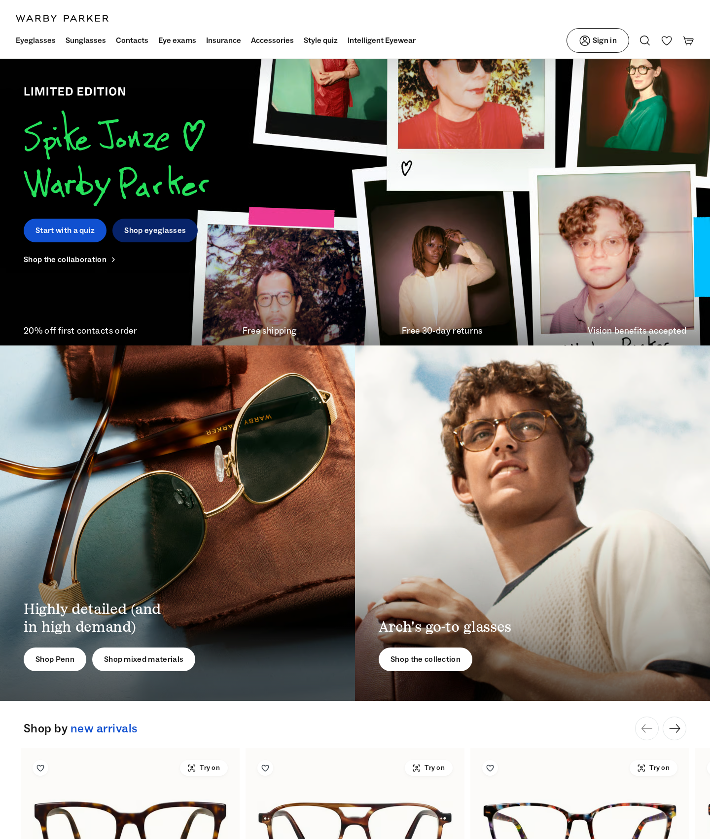
Warby Parker's homepage
“Pick one primary action. Three competing CTAs destroy focus.”
The layout has a strong editorial foundation. The visual execution lacks priority. Stacking three different pathways in the hero forces users to make a choice the interface should make for them. Clean up the typographic noise and anchor the promo text to restore discipline.
Narrative & Storytelling
5.5/10
The screen tells three stories at once: a limited-edition collaboration, a utility quiz, and standard shopping. Visitors must parse competing paths…
Usability
6.5/10
The main navigation is clean. Critical promotional details disappear against the busy background imagery.
Visual Design
6.0/10
The grid structure is strong. Typographic discipline breaks down under too many contrasting styles.
Innovation
5.0/10
The page relies on predictable e-commerce layouts. It fails to elevate the digital try-on experience.
What's wrong
-
Three competing calls to action in the hero
The interface presents three paths of equal visual weight. This shifts the burden of prioritization from the design to the user.
-
Low-contrast promotional banner text
White text placed over a multi-colored photo collage is unreadable. Important customer incentives like 'Free shipping' disappear.
-
Asymmetric button layout in the split grid
An uneven button count between the left and right columns throws off the visual balance. The horizontal alignment feels broken.
What to fix first
-
Establish a single clear hero action
Focus entirely on the collaboration. Make 'Shop the collaboration' the primary button. Relegate the style quiz to a secondary link.
-
Isolate promotional text inside a solid banner
Place the promotional text inside a solid, high-contrast horizontal bar at the bottom of the hero collage. This guarantees legibility and structure.
-
Standardize split-grid button alignment
Simplify the split-section. Use a single, consistently styled button in each column to restore visual rhythm and symmetry.
Get this for your own screens
Upload a screenshot and get a scored, evidence-backed critique in about a minute. Your first report is free — no account needed.
Critique your design